Free library for community
Connected ecosystem
This library is built to support digital product design, providing a structured system that helps you save hours of setup time at the start of every project.

Two design libraries for Figma

One production-ready library for Webflow
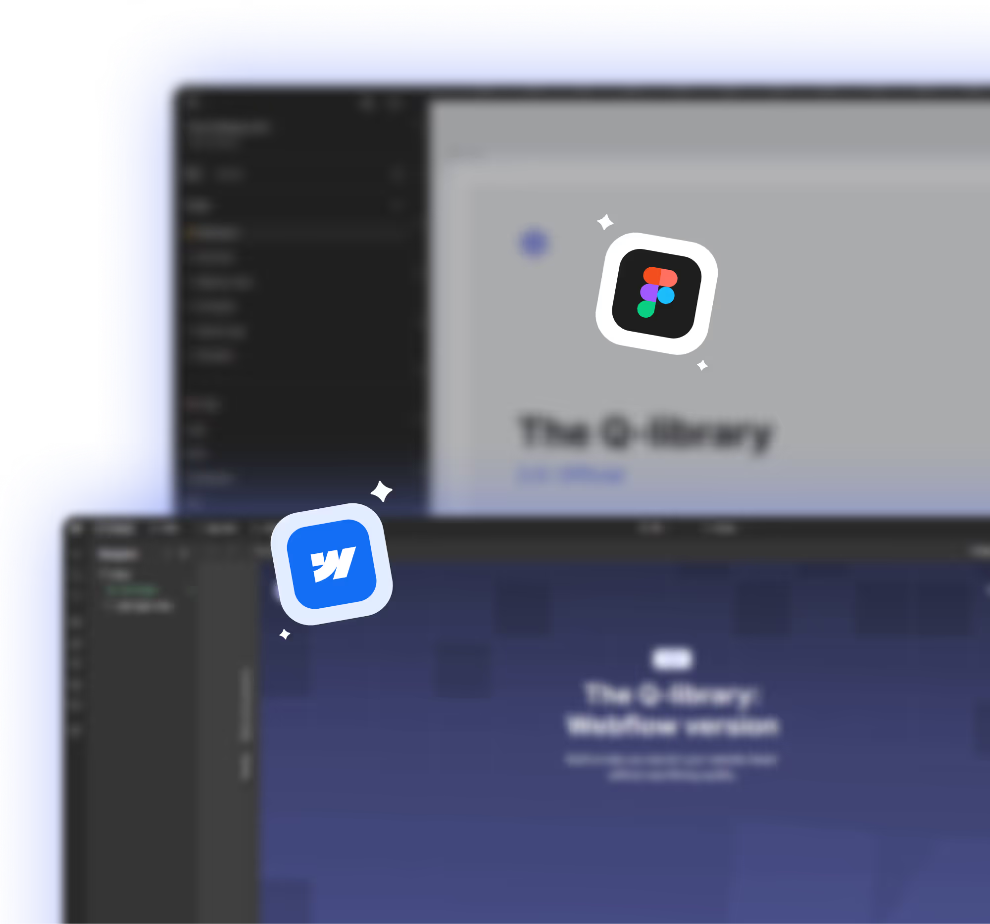
Synchronized and seamless
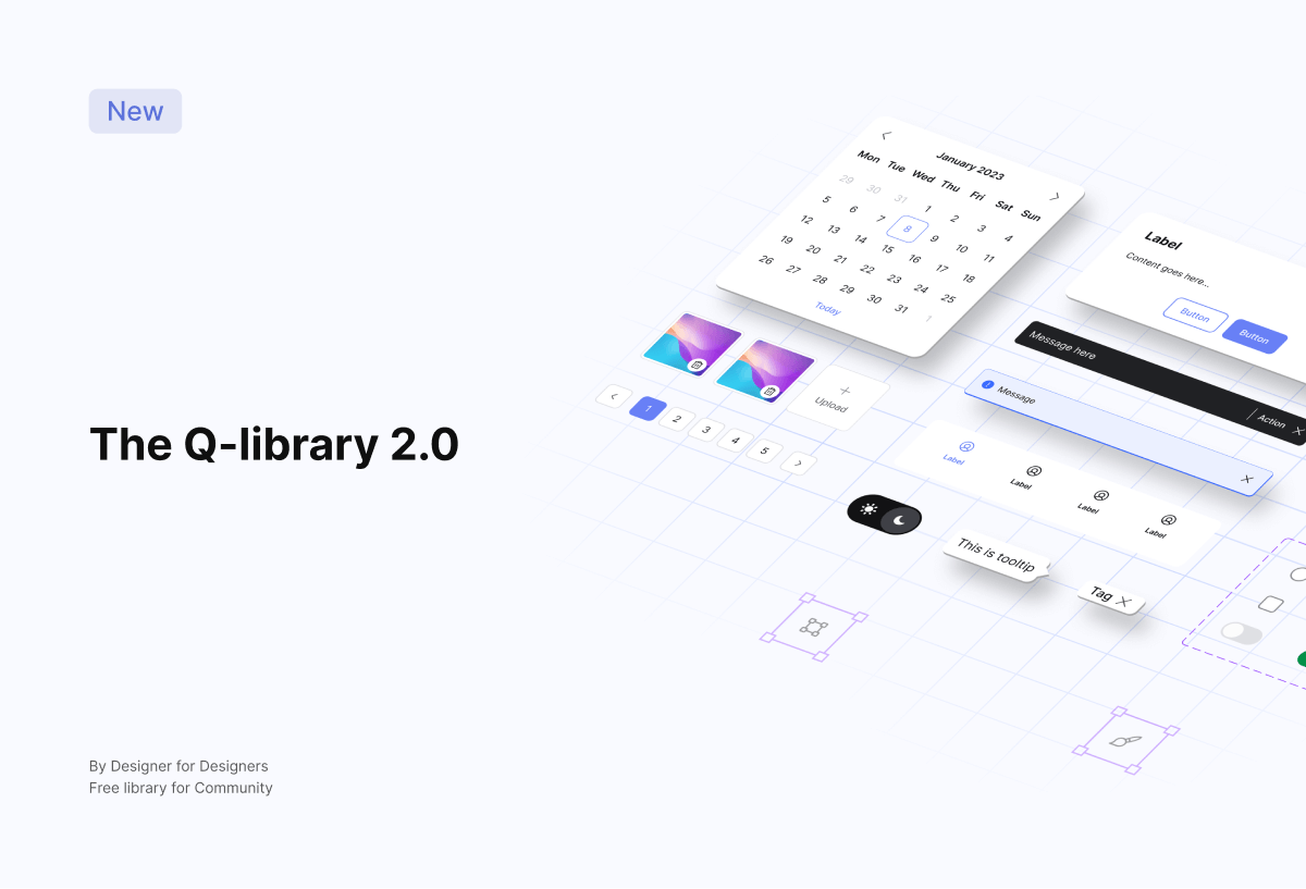
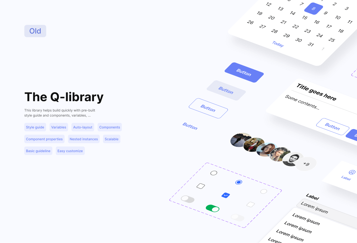
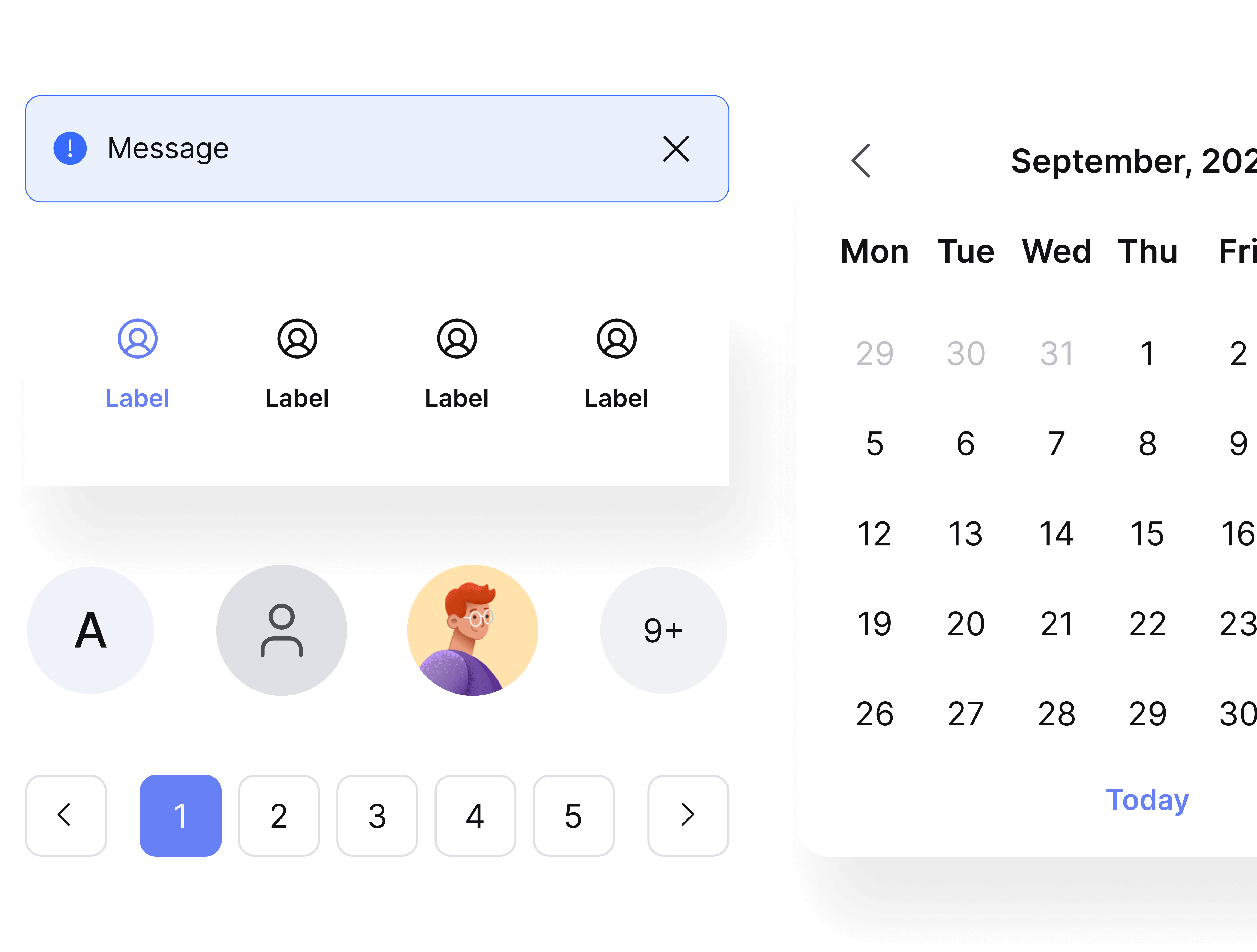
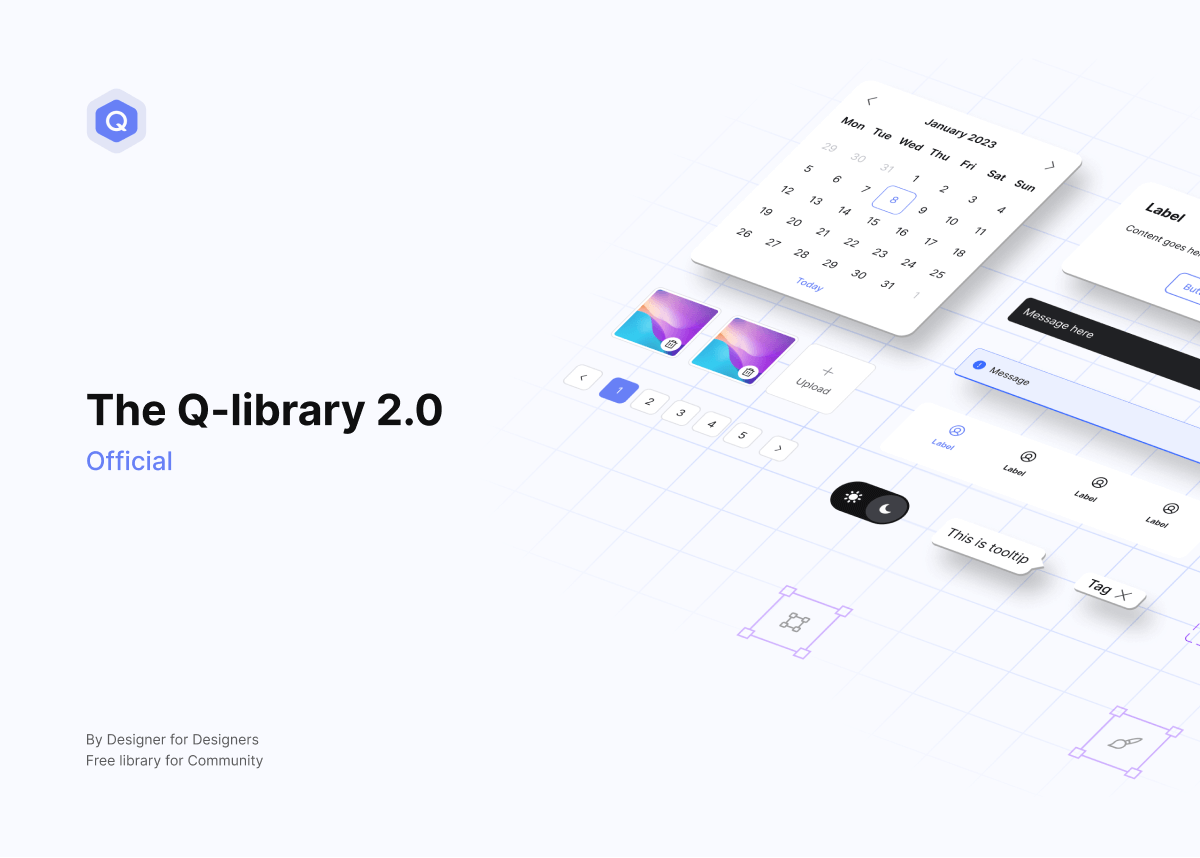
The Q-library 2.0
Released on September 2023, v1.0 was built on atomic design principles with pre-built style guides and ready-to-use components, and was upgraded to v2.0 with clearer structures and further improvements to help projects start fast and scale easily.
Built for full-scale products and long-term systems with a clear, well-structured variable setup. Ideal for product teams, complex interfaces, and projects with high demands for variables.

Full variables tiers: global, alias, component-specific

Light & Dark mode support

Fully structured Auto Layout

Reusable components for web & app

Component properties & nested instances

A simplified version optimized around variables for fast moving projects and small to mid-sized teams. Perfect for MVPs, landing pages, and quick client work, with the flexibility to grow into a long-term system.
Two variables tiers: global, alias
Light & Dark mode support
Fully structured Auto Layout
Reusable components for web & app

Added more variants to selected components
Component properties & nested instances
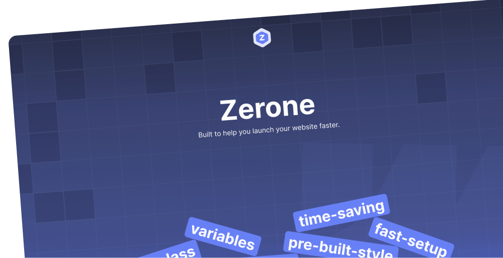
Zerone library
All global classes are ready to use. Easily and flexibly customize them for any specific need or context. Build faster, stay consistent, and scale your system without rework.
Pre-styled default HTML tags like texts and elements. Use them to keep typography and basic elements or components consistent across your project.


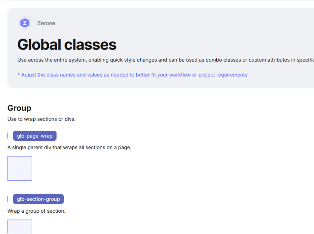
Ready-to-use classes for sections and divs. Use them to quickly build layout structure, spacing and alignment,... efficiently without custom styling.
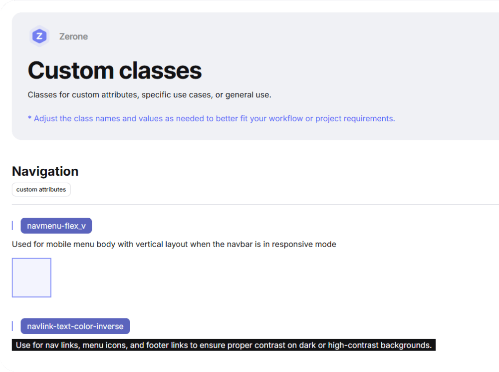
Classes for custom attributes and special use cases. Keeps your system flexible and easy to manage and help avoid long or complex combo classes.
Built to help you start strong